THE therapist
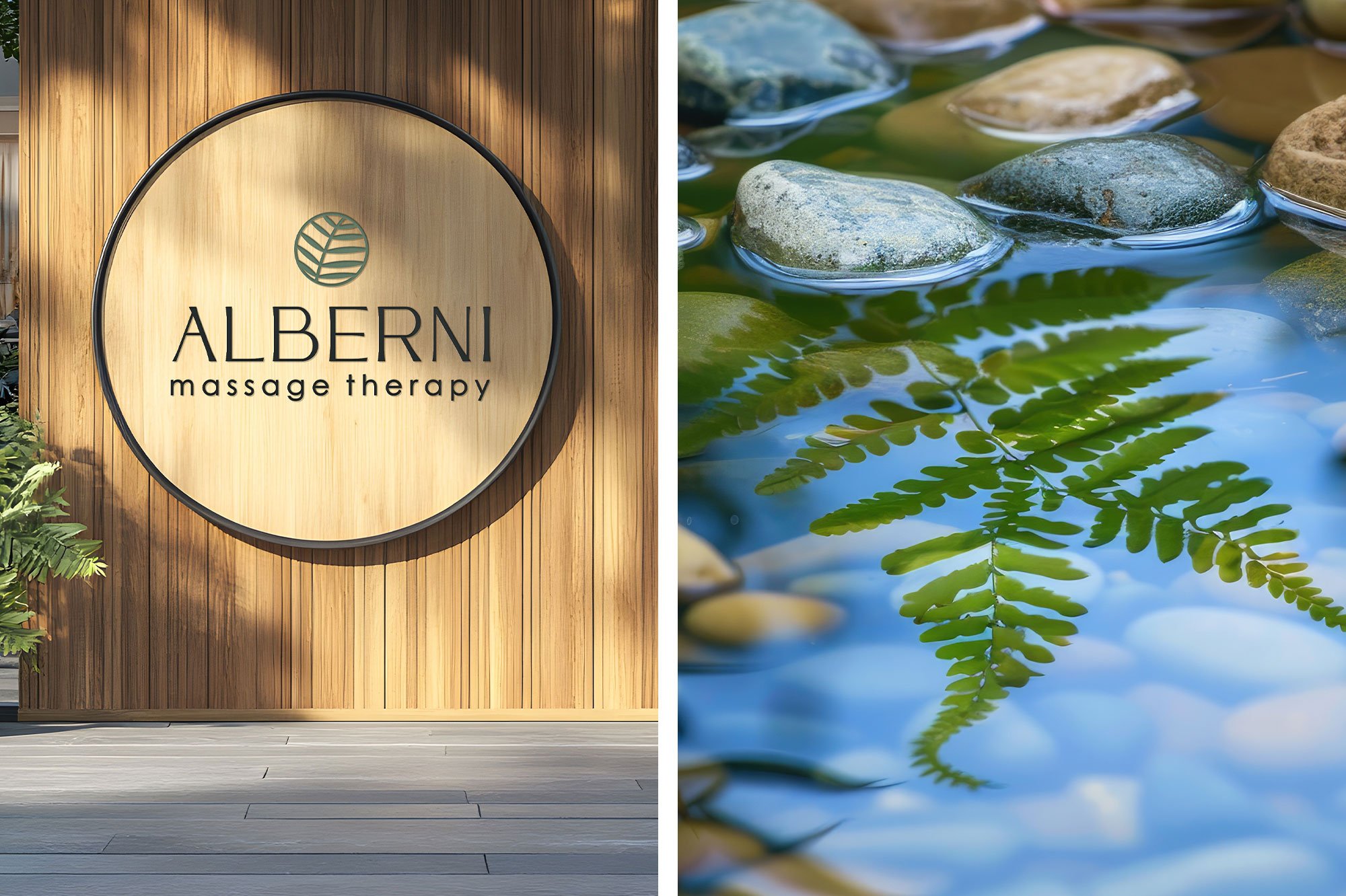
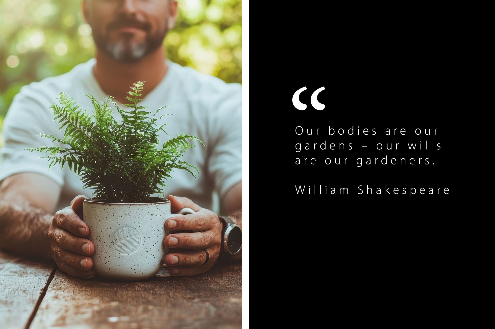
Andi approached me wanting a brand refresh and new website for her massage therapy clinic. Her existing 'rustic' logo had become outdated and with the clinic's fast expanding team we needed to align the rebrand with her business's growth. It was important to her that the brand be clean and professional without losing the feeling of human connectivity her clients had come to trust. The goal was to portray a medical professionalism without appearing sterile. Instead of scrapping the existing fern concept I decided to lean into this delicate symbol of nature which draws paralells to the human need to nurture ourselves with thoughtful care. The dated graphic evolved into an iconic mark, the moody green replaced with a soft sage and the coarse lettering with refined, sophisticated typography. This project included a new logo and mark, custom graphics, brand palette, website design and development.